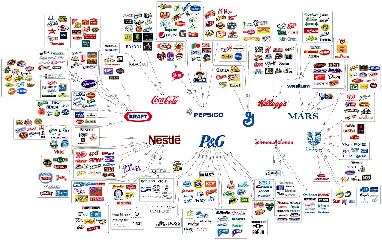
A logo represents a company's ideas, nature, values and its vision for the future. The purpose of a logo is to create an ever-lasting impression in people's mind about a company and its values. People should be able to relate a company's quality and values through its logo. A unique and timeless logo design plays a pivotal role in building a company's brand image.
Contrary to the usual perspective of most designers, a logo need not be a masterpiece in the world of design. A logo need not be a proof of a designer's designing prowess and need not flaunt the latest trends in the world of logo design. People judge a company by its logo and the logo is judged based on the elements that form its design. Here are a few tips on designing a logo which can be useful in creating a unique and memorable design:
Unique Design
A logo should always stand out among competition. It must be unique in such a way that people relate the logo only to a single company and are not confused as to which company the logo belongs to.


 According to the latest logo design news, experts suggest not to follow logo fads and trends. A well designed logo is timeless and holds value even after several years since its inception.
It is important to note how a simple three-pointed star has been the sole logo of Mercedes-Benz even after around 80 years since the company came out with the logo. The logo has seen many a wars and economic downturns, yet surviving in people's minds and is one of the most recognized logo worldwide.
Experts also warn against copying or getting inspired by another company's logo design. Such an approach not only results in being sued over trademark violations, but also gives a message to the world that your company doesn't have its own identity.
Adaptable Design
In a world where publicity materials can vary from being as small as a brochure to largely circulated magazines to business cards to websites, a logo should be designed in such a way that it looks equally good and equally compact on all these forms of display items. The logo should consist of readable text, not too small, not too big.
One can see how the logos of companies like AT&T, HP, IBM etc have logos that are not only compact but are adaptable across all kinds of media.
Keep your Logo Simple
Simplicity always goes hand in hand with beauty. Simple fonts like Times New Romans, Helvetica and Arial make the logo easily readable. Also, most of the companies listed on Fortune 500, use less than three colors and have minimal variations in the fonts used. It is widely accepted by experts in logo design that too many colors and fonts can spoil an image and make it less retainable.
One good example of a simple logo design is that of Apple Inc. The logo, which is nothing but an apple with a bite taken off on one side, is again one of the most recognized logos in the world today. Also, the colorful apple logo design was dropped by the company as it entered the modern era of technology and kept itself in sync with the world while keeping its fundamental concept of an apple intact.
A company should always try to express its business, its culture, its values and more importantly its vision through a simple, unique and adaptable logo design.