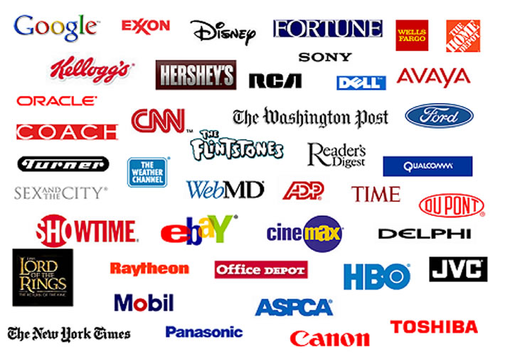
Colors and Fonts in logos:
Color plays a vital role in branding your identity and therefore creation of your logo. Slight changes in color and font results a fully professional logo that is apt for your business.
Colors in logos are very important. Many companies have priority for certain color(s) and they want their logo to contain that color. Choice of colors can be different depending on industry. Color shades used in a automobile company’s logo can be completely different from colors in a beauty and skin-care company’s logo. Your logo colors of font and background should be chosen in a way that your logo gets highlighted and color shades are not changed in both printed form and on online copy.
Today’s logos are designed following the web 2.0 standards. Use of gradient color and mirror image in logos create an impression. Fonts play an important role in the logo design. The font characters should be spaced far enough. Bold fonts signify a sense of strength and dynamism. Choice of fonts and colors depend on how companies want to represent their business through their logos. Both formal and informal fonts are used in logos depending on company’s viewpoint. Depending on target audience’s taste and choice, the font and colors of logo can be changed. Variation in font size can bring and font shape can bring amazing effects on your font.


How color and Fonts are related with usage of logos?
You can use your logo both online and offline. For online business, a logo can be used as your identifying business symbol in social book marking sites and forums. For offline purpose, starting from your letterhead, a logo can be printed on all products and displayed in every business promotion.
Printers may not recognize all the color shades of your logo. Softcopy of logo may not look the same in printed form. Also, color variation may occur when your logo will be used on glass, cardboards etc. Color variation happens due use of logo on different media.
On computer, your logo fonts look prominent. On business letter-head, Serif fonts (like, Times New Roman, Bookman) and Sans Serif fonts (like, Arial, Helvetica) look best. These fonts are easy to read also.
Color and Fonts should form an impression that represents your business with a single logo. If you use both multiple colors and text in your logo, then you can better understand what I’m talking about.